Idaho Falls Pediatrics

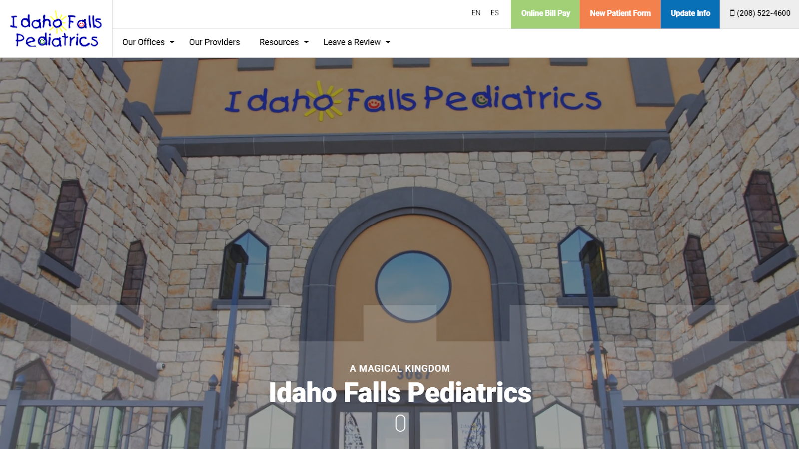
Idaho Falls Pediatrics recently built a new castle for their main office, and we are loving it. But with a bright, shiny new castle, they needed some sweet updates to their website too. This fun, loving pediatric office now has the castle and website of their dreams.
Content
A large part of this project was moving their content over into an upgraded version of their content management system. Our content team worked together to help organize their English and Spanish content in a more user friendly way and worked with the Idaho Falls Pediatrics team to update and remove any content that was outdated.
Design
This is where the project really got fun. We wanted to deliver a look that really brings in that castle feel to their website too. So our designer put together some fun castle-like elements throughout the site:
- On the home page banner, and the interior page banners throughout the site, we’ve added a subtle castle wall overlay behind the banner text
- In the footer of the site, we added a castle graphic as a watermark
- Our designer created custom background textures that give off a brick castle wall vibe and incorporate the fun colors of this brand

Beyond making this website a castle itself, we had some amazing photo and video work from Idaho Falls Pediatrics to utilize in strategic places on their website. Our team took splices from a commercial that was created for this office and put them together into a cohesive background video for their home page (you can also see their full commercial embedded at the bottom of the page).
Development
Our development team built the custom online bill pay, new patient, and update info forms on the previous website, and they adapted these to work just as well on the new website.
Photography
Most of the video and photo work was handed over to our team to incorporate on this new site, but our photographer was able to go over to the new castle for a provider photoshoot. Using the character murals of the exam rooms as backdrops, we got updated photos for each of the providers so patients and parents can get to know them before they visit the office.

Check out this new site at ifpeds.com.

About the author
MWS